One of my favorite books is a bibliogeek’s dream entitled The Visual Display of Quantitative Information written by Edward Tufte. It’s not light reading, but it is fascinating, even for non-geeks. The point of the book is to explain how to take a lot of information and compact it into a small, easily digestible package.
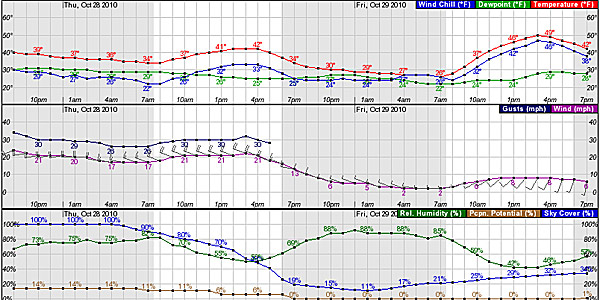
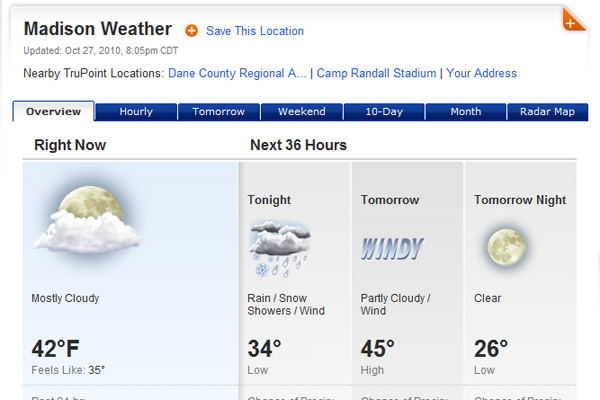
The National Oceanic and Atmospheric Administration (NOAA) produces wonderful graphics, where they put a lot of data in this small space, and it’s easy to follow. Thing is, you can look at weather.com and get a lot of what Tufte calls “chartjunk,” which is ink that conveys little or no information. Like this stuff.
Ooh. Pretty moon with clouds. Worthless.
This is not worthless.
You don’t have to be a geek to enjoy this stuff. You can enjoy the patterns; develop the ability to squint at a graph and get a gestalt view of what’s going to happen without having to think about it. First graders read words a letter at a time; the word is D-O-G. After reading for years, you see the whole word or maybe even two or more words at a time. After developing familiarity with these graphs, I look at them and I see the weather patterns in my brain. It’s cool.
One thing I like about living in the Midwest is the weather. And one thing I didn’t like about California is the lack of weather. Here, things are weird. If you don’t like the weather, wait half a day–or even an hour. A 10 degree drop in temperature is not uncommon when a fast front comes blasting through.
Respectfully submitted,
Canoelover


Darren, Tufte is on my bookshelf, too. Nice post!
I also find the majority of weather sites provide only the most useless information. iPhone weather apps are even worse.
This is a great post.
Cheers,
David Johnston
http://www.paddlinginstructor.com